Lighting isn’t just about brightness; it’s about how that brightness feels. A room with the same light level can feel cozy or clinical depending on the color tone, which is defined by CCT (Correlated Color Temperature). Measured in Kelvin (K), CCT determines whether light appears warm, neutral, or cool.
Research shows that lighting with the right CCT can improve mood, reduce eye strain, and even boost productivity. According to the U.S. Department of Energy, appropriate lighting can enhance workplace performance by up to 16%, while cooler tones (5000K–6500K) have been linked to greater alertness and focus.
Whether you’re lighting a living room, designing a retail display, or upgrading office lighting, understanding CCT helps you make better choices for comfort, efficiency, and visual clarity. This guide’ll explain what CCT means, how it’s measured, and where to use each color temperature effectively.
Hide
What is CCT in Lighting?
CCT (Correlated Color Temperature) refers to the color appearance of white light emitted by a light source, measured in Kelvin (K). It indicates whether the light looks warm (yellow/red tones), neutral, or cool (blue tones), affecting how a space looks and feels.
To understand how CCT influences lighting design and human perception, let’s break it down into key points:
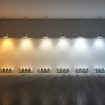
- Measured in Kelvin (K): The scale ranges from 1000K to 10,000K, though most practical lighting uses fall between 2200K and 6500K.
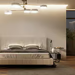
- Warm Light (2200K–3000K): Produces a soft, yellowish glow ideal for cozy, relaxing spaces like bedrooms or restaurants.
- Neutral White (3500K–4000K): Balanced tone used in offices, retail, and kitchens for a clean, natural look.
- Cool Light (5000K–6500K): Bright and bluish, used in hospitals, studios, and task-heavy environments for clarity and focus.
- Not related to brightness: CCT affects color tone, not how bright the light feels (which is measured in lumens).
The History and Science Behind Color Temperature
The concept of color temperature originates from 19th-century physics and the study of blackbody radiation. In 1860, physicist Gustav Kirchhoff introduced the idea of a perfect blackbody. In 1900, Max Planck developed the blackbody radiation law, showing how heated objects emit light that shifts in color from red to white to blue as temperature increases.
This discovery led to the creation of the Kelvin scale, named after Lord Kelvin (William Thomson), which became the standard for measuring color temperature. As electric lighting evolved from incandescent bulbs in the 1870s to fluorescent lamps in the 1930s and LEDs in the 1960s, the lighting industry began using Correlated Color Temperature (CCT) to define the visual tone of white light.
Today, CCT is a critical specification used to design and select lighting for residential, commercial, and industrial environments.
How is CCT Measured?
CCT is measured in Kelvin (K) by comparing the color of a light source to the light emitted by an ideal blackbody radiator at a specific temperature. The result indicates whether the light appears warm, neutral, or cool to the human eye.
To determine this, lighting engineers use photometric equipment in controlled environments. The most common tool is a spectroradiometer, which analyzes the spectral power distribution (SPD) of a light source. This data is then plotted against the Planckian locus, a curve on the chromaticity diagram representing the colors of light emitted by a true blackbody at various temperatures.
If the light source’s color closely matches a point on this curve, its Correlated Color Temperature is assigned accordingly. For example, a match near 2700K indicates warm white light, while one near 6500K indicates daylight or cool white light. In practice, most commercial lighting products fall between 2200K and 6500K.
Standardized testing methods, such as IES LM-79 and ANSI C78.377, ensure consistent CCT labeling across manufacturers. These standards require measurement under specified conditions to maintain accuracy and reliability in product specification.
The Visual Effect of Different CCTs
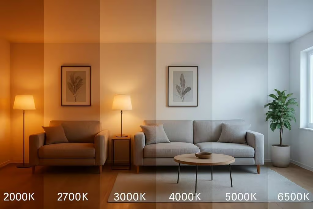
Different CCT levels create different moods, change how colors appear, and affect how a space feels. Even with the same brightness, a warm light can make a room feel inviting, while a cool light can feel more alert and clinical.
Understanding how each color temperature looks and where it works best can help you choose lighting that fits both the style and function of a room. Here’s a breakdown of typical CCT ranges and their visual impact:
| CCT (Kelvin) | Light Tone | Visual Effect | Common Uses |
| 2200K–2700K | Very Warm White | Cozy, intimate, relaxing | Restaurants, living rooms, bedrooms |
| 3000K | Warm White | Comfortable, calm | Residential lighting, hotel rooms |
| 3500K–4000K | Neutral White | Balanced, clean, natural | Offices, retail spaces, schools |
| 5000K | Cool White | Crisp, energizing | Hospitals, workshops, garages |
| 6000K–6500K | Daylight White | Sharp, blueish, focused | Studios, outdoor security lighting |
Each range affects not just the look of the room, but also how people feel and perform in that space. For example, warm tones are ideal for winding down, while cooler tones are better for focus and visibility.
Applications of CCT in Lighting Design
Different spaces call for different lighting moods and purposes. Here’s how CCT is applied in various settings:
1. Residential Lighting
In homes, warm white light (2700K–3000K) is typically preferred. It makes spaces feel cozy and welcoming. Ideal for:
- Bedrooms
- Living Rooms
- Dining Areas
Bathrooms and kitchens may use 3500K–4000K lighting for better visibility without feeling too cold.
2. Commercial Lighting
Retail stores and workspaces often opt for 3500K–4500K, which gives a natural look and improves color visibility, important for products and displays. Offices also benefit from neutral white light, promoting alertness without glare.
3. Industrial and Medical Settings
Factories, laboratories, and hospitals usually require cool white to daylight (5000K–6500K) lighting. These tones enhance clarity, detail, and productivity, especially for tasks requiring precision.
4. Outdoor Lighting
Streetlights, parking areas, and landscape lighting use a mix of 3000K–5000K, depending on whether warmth or brightness is prioritized. Daylight LEDs are popular for outdoor security due to their high contrast and brightness.
How CCT Affects Daily Life
CCT affects how you feel, how you work, and how well you relax. The color of your lighting can shape your mood, energy, and comfort.
- Cool white light (5000K–6500K) helps you stay alert and focused. It works best in the morning or in places like offices and kitchens.
- Warm white light (2700K–3000K) helps you relax. It’s perfect for evenings, bedrooms, and living rooms.
- The right CCT also reduces eye strain and makes everyday tasks more comfortable.
- Warm light feels calm and cozy. Cool light feels clean and sharp but can feel too harsh at night.
Choosing the right light color at the right time improves how you live every day.
Benefits of Understanding and Using CCT Correctly
Choosing the right color temperature isn’t just about looks, it helps you create the right environment for comfort, focus, and health. When you understand how CCT works, you can use lighting more effectively in any space.
Here are the key benefits:
- Improved comfort: Warm light makes rooms feel cozy, while cool light keeps you alert. Picking the right tone helps match the mood of each space.
- Better focus and productivity: Cooler CCTs in work areas can reduce fatigue and help you stay focused longer.
- Healthier daily rhythm: Using warmer light in the evening supports better sleep by reducing blue light exposure.
- More accurate lighting design: Understanding CCT helps you balance light with furniture, wall colors, and natural daylight for a more consistent look.
- Smart lighting control: Many LED systems let you adjust CCT as needed, giving you full control over the mood and function of your lighting.
Learning how to use CCT properly can make your home or workspace feel better, look better, and work better too.
CCT vs CRI – What’s the Difference?
CCT and CRI are both lighting terms, but they measure very different things. CCT tells you the color tone of the light (warm or cool), while CRI measures how accurately that light shows the true colors of objects.
Here’s how they compare:
| Term | Stands For | What It Measures | Scale | Use |
| CCT | Correlated Color Temperature | The color appearance of white light (warm to cool) | Kelvin (K) | Helps set the mood or atmosphere |
| CRI | Color Rendering Index | How true colors look under a specific light source | 0 to 100 | Important for color accuracy (e.g., art, retail) |
Example:
A 3000K light is warm and relaxing, but if it has a low CRI (below 80), colors in the room may look dull or unnatural. A higher CRI (90+) shows colors more accurately, even at the same CCT.
Understanding both helps you choose lighting that looks good and performs well.
FAQs
Final Thoughts
Understanding CCT in lighting helps you choose lights that not only look good but feel right. Whether you’re aiming to create a cozy home, a productive office, or a vibrant retail environment, color temperature plays a central role. With the rise of LED technology and smart lighting systems, selecting and adjusting the perfect CCT has never been easier. Make your spaces more functional, more beautiful, and more human-friendly—just by choosing the right color temperature.